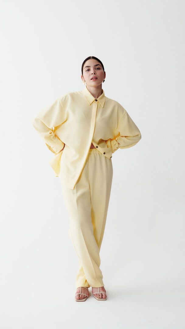
There was a time when colour trends belonged almost entirely to fashion.
A designer would send a colour down the runway. Beauty brands would follow. Home décor would catch up months later. That cycle doesn’t exist anymore.

There was a time when colour trends belonged almost entirely to fashion.
A designer would send a colour down the runway. Beauty brands would follow. Home décor would catch up months later. That cycle doesn’t exist anymore.
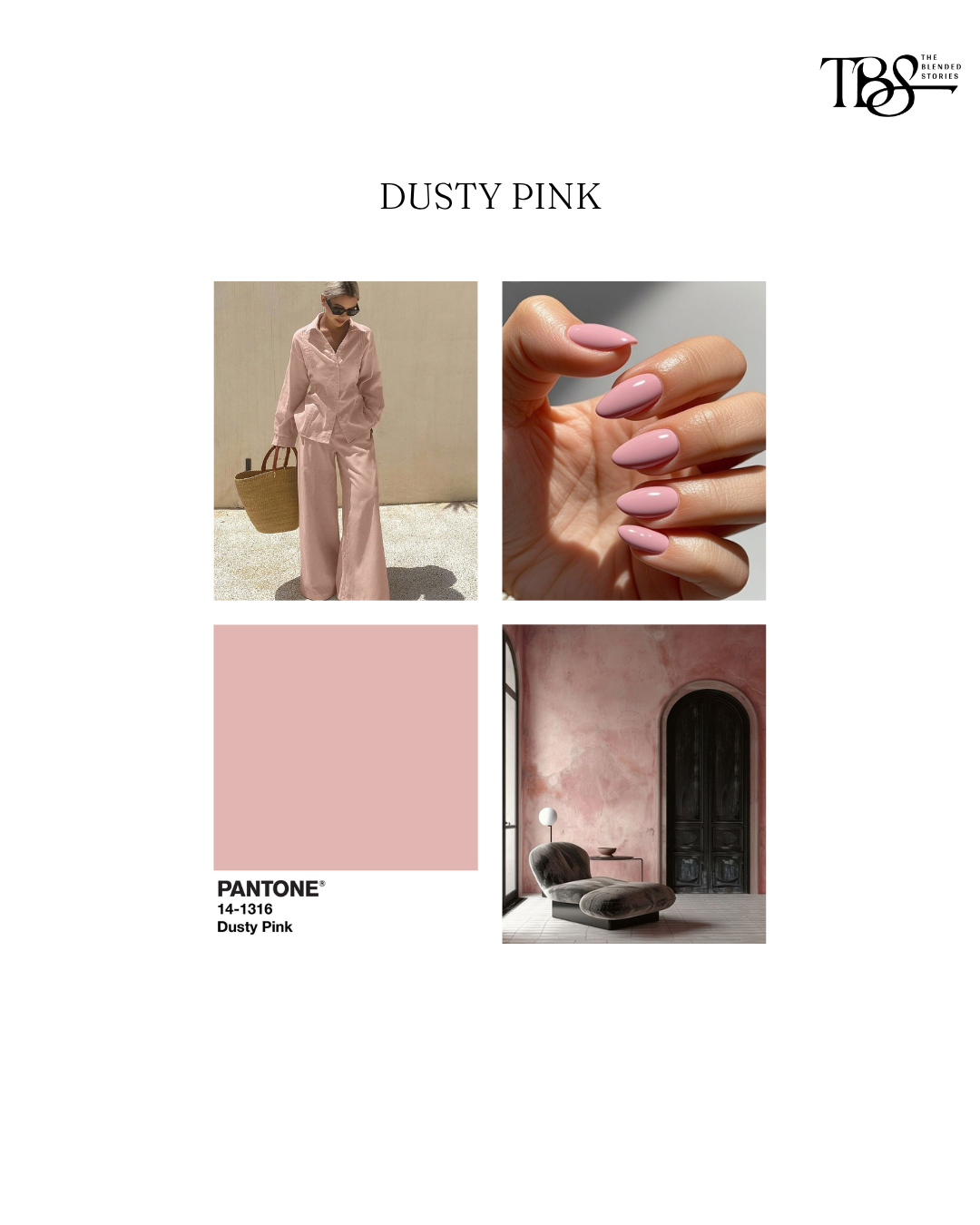
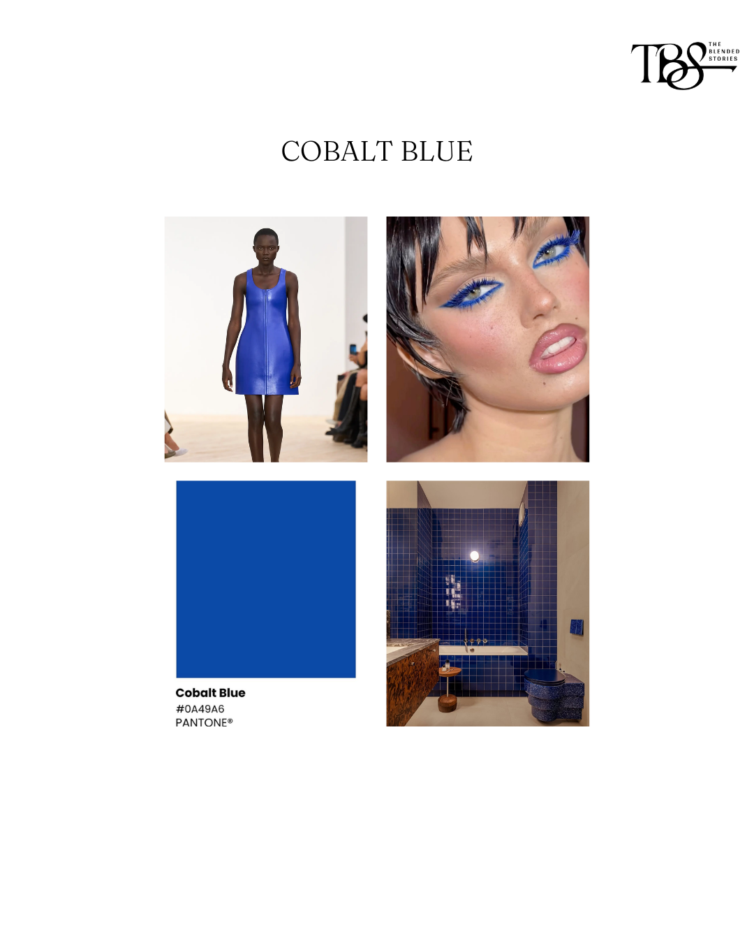
Today, inspiration moves in every direction. A boutique hotel influences a beauty campaign. A café inspires a furniture collection. A fashion show shapes a wedding mood board. Suddenly, every industry is borrowing from the same visual language. That’s exactly what’s happening in 2026.
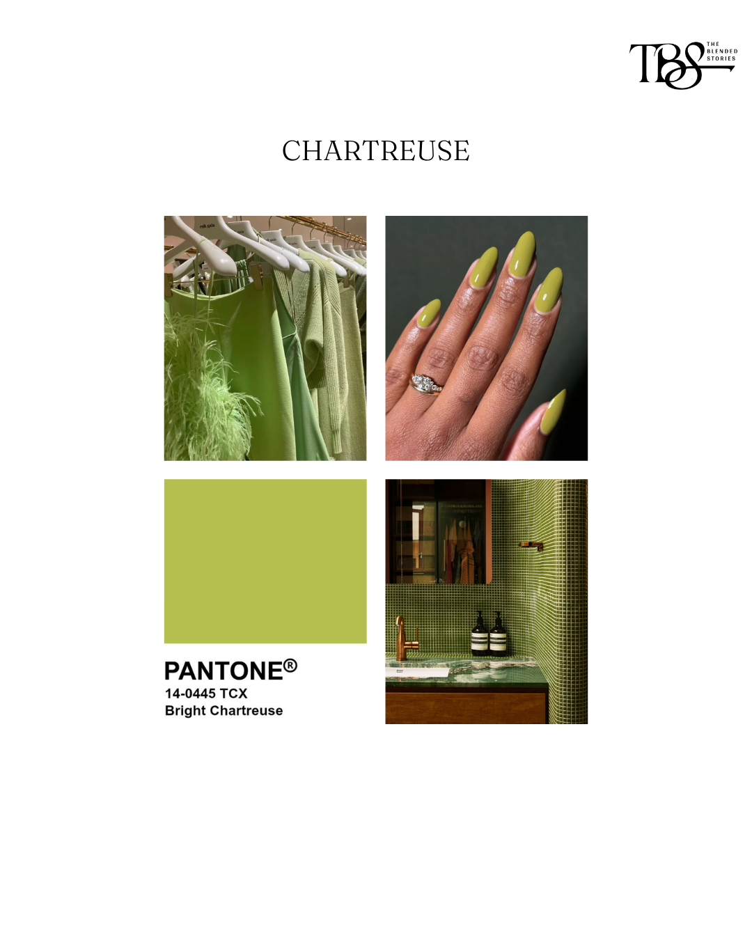
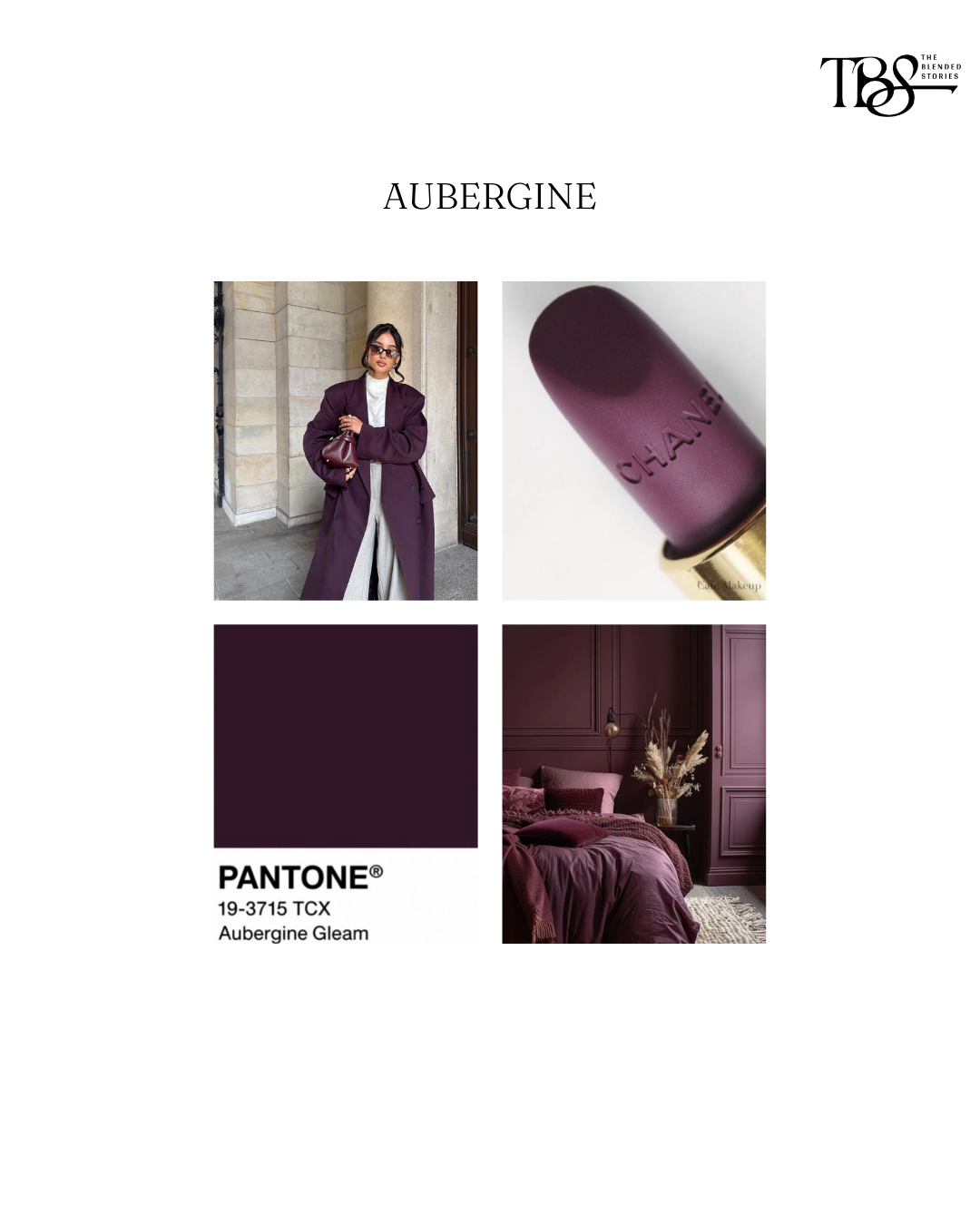
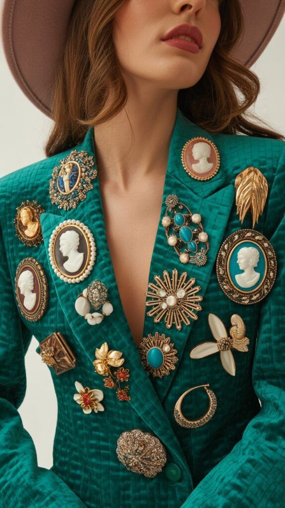
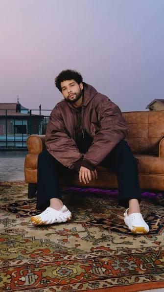
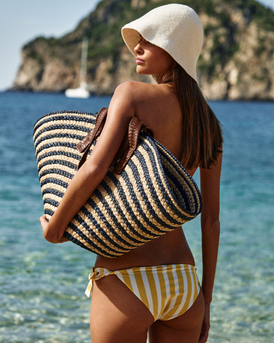
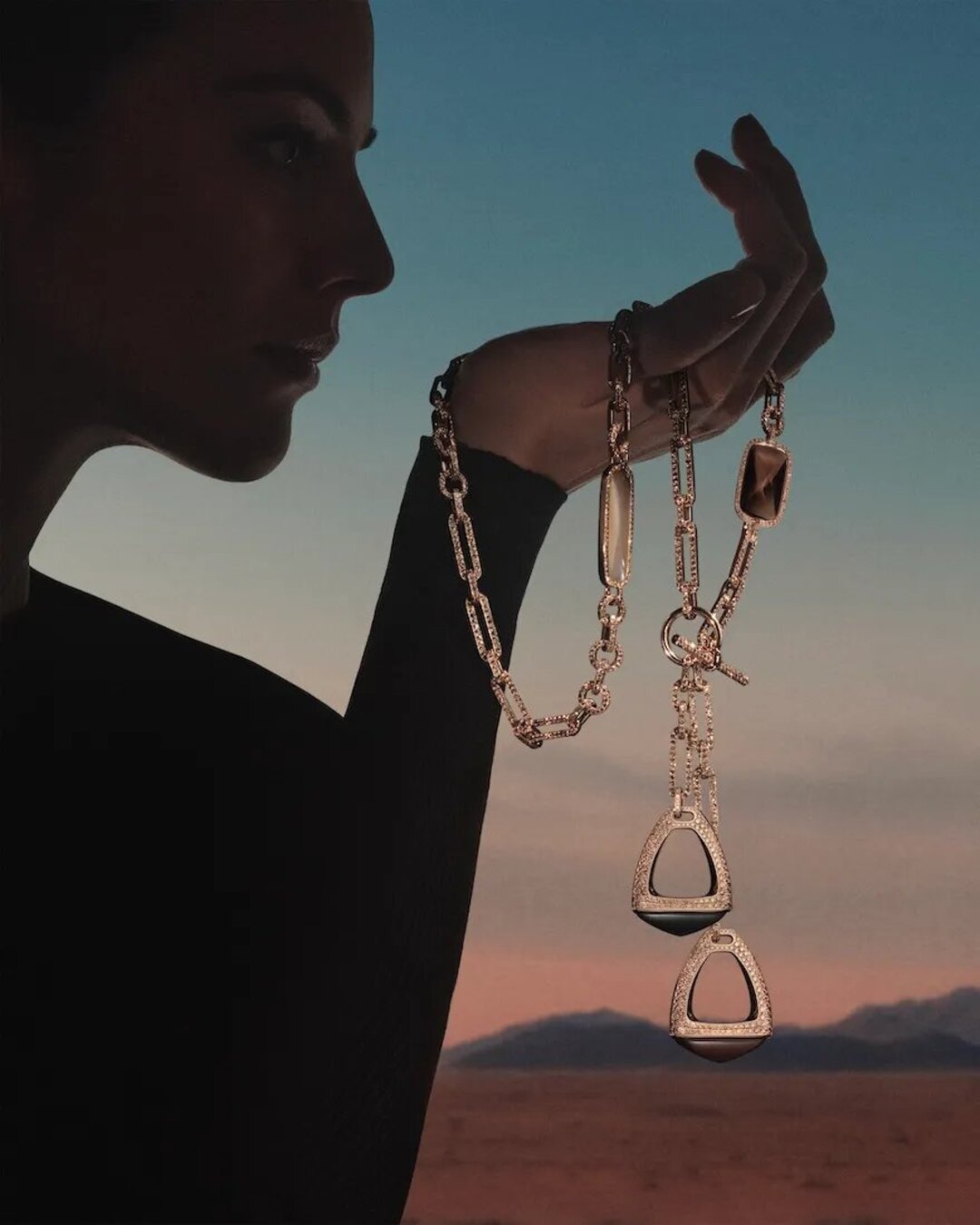
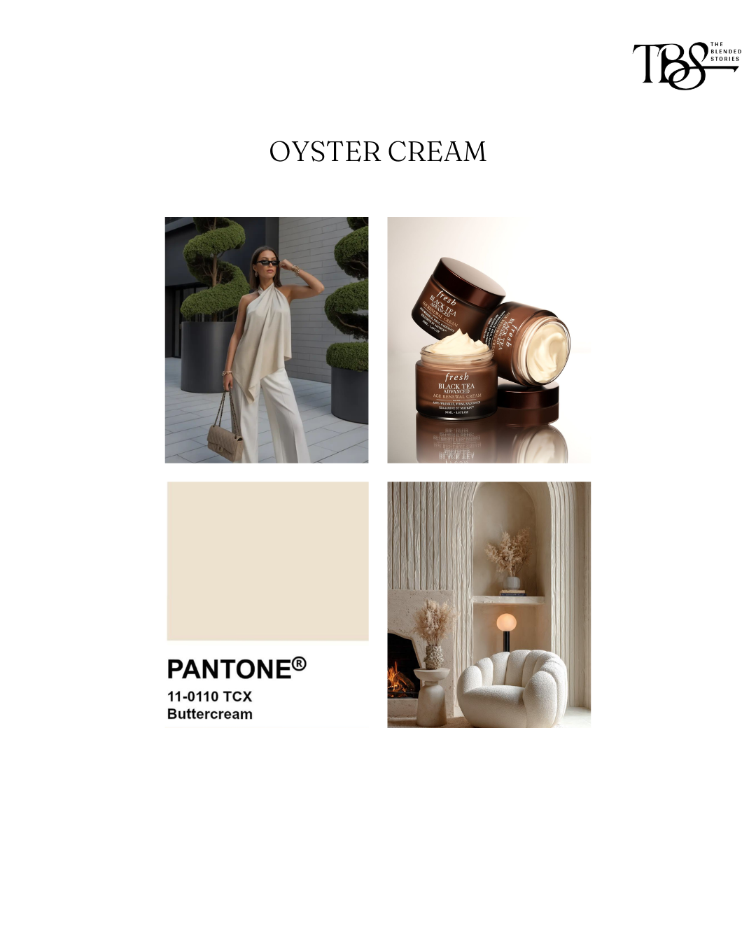
Instead of loud, statement shades, we’re seeing colours that feel softer, warmer and easier to live with. Butter yellow has replaced brighter citrus tones. Mocha brown is becoming the neutral of choice. Powder blue brings a sense of calm, while pistachio green feels fresh without trying too hard. Even cherry red has become more intentional, appearing as an accent rather than the entire look.
The interesting part isn’t the colours themselves.
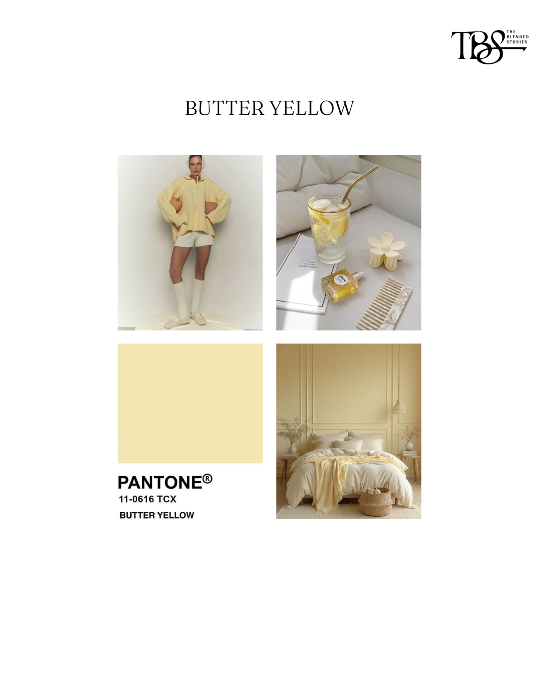
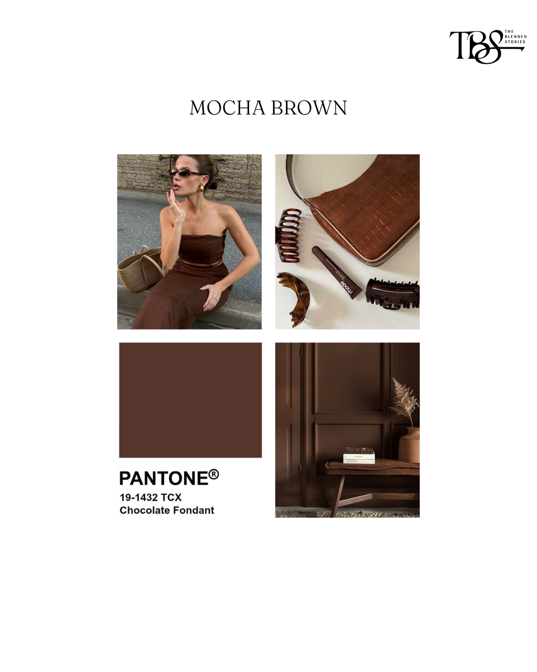
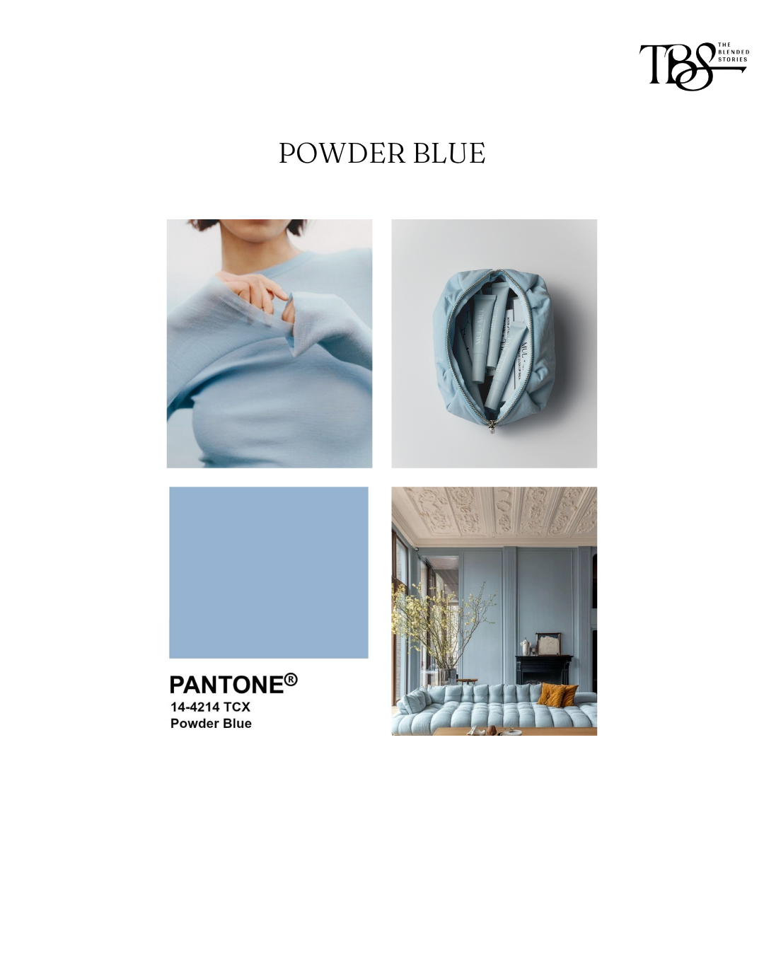
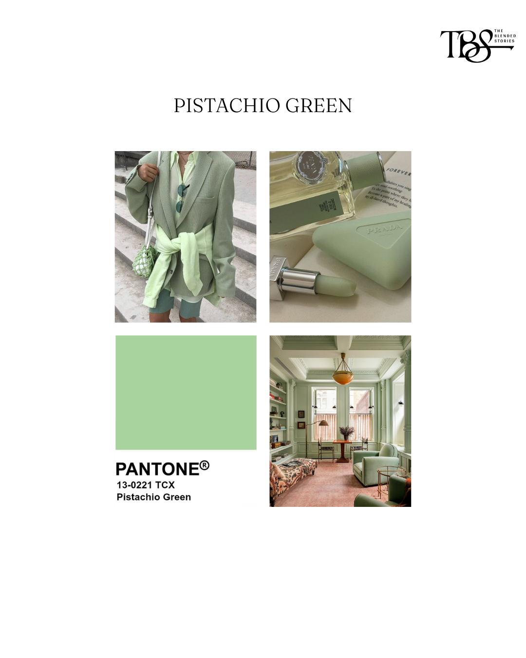
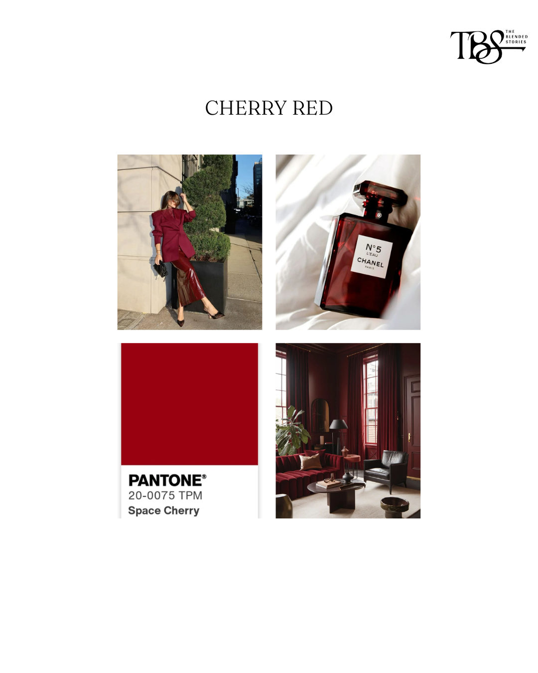
It’s where they’re showing up. Runways. Beauty packaging. Boutique hotels. Restaurants. Furniture. Fashion campaigns. Even product design. When completely different industries begin reaching for the same palette, it’s usually a sign those colours are no longer just a trend. They’re becoming part of everyday culture.
We're making your inbox interesting. Enter your email to get our best reads and exclusive insights from our editors delivered directly to you.